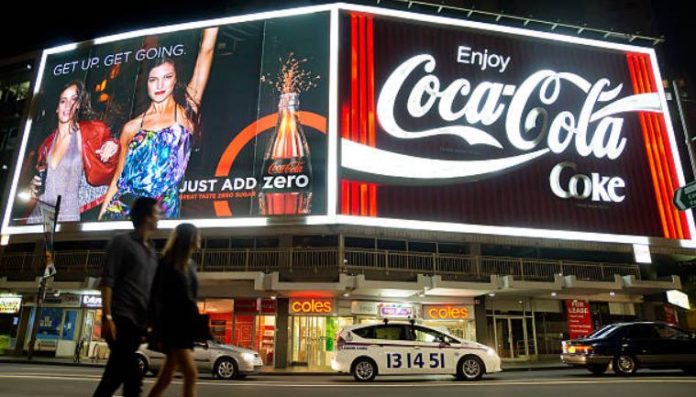
Billboard having been going for quite a long time now and are still effective as a means to promote your business as they were years ago despite the rapidly evolving advertising industry. However, there are some strategies with billboard advertising that work better than others.
First ask yourself whether you can get your promotional message across effectively to motorists driving at over 50 miles an hour along a highway?
Most billboards are situated on highways or road with a high density of traffic, but believe it or not are almost useless as promotional material as they are not conceived for a fast moving public.
If you intend to install one of your billboards on one of these road arteries make sure your ad will have an impact on the people passing along this way and have it created with these elements in mind.
Some promotional messages on billboards are too sophisticated and subliminal to work. People driving by just do not have time to think about what you are trying to get at.
Make it brief, simple and to the point if you want your message to have a positive impact on your sales.
When you have a billboard you have also plenty of space to take advantage of, so avoid placing your business name in the lower left or right of the billboard where people will never see it.
That means defeating the object of your ad, which is letting people know who you are and where they can contact you.
These types of mistakes are often made by advertising companies that do not have much experience in billboard advertising, which requires experience when dealing with larger dimensions that have to be clearly viewed from a distance.
Make sure that when you have your billboard design created there is enough contrast between the script and the background.
Some billboards come with a light background and a white text, which renders the promotional message invisible to those driving by.
Do not think that because your billboard is big you can fit in lots of text and images, for it will just turn out to be a big muddle nobody can decipher.
A billboard has to have an immediate impact on the public without any doubt on the message you are trying to relay.
So make sure you place a few words and graphics strategically allowing for plenty of background space.
Nowadays with the advent of digital signage businesses are tempted to cram in as many images and promotional messages they can and this is simply renders the advertisement useless.
These principles also apply to some indoor billboards where the public will not stand in front of your billboard for minutes, but will simply stroll by while observing other products, this will happen in shopping center or trade shows.
So make sure you create your billboard keeping in mind that the simpler and harder the impact on the public the more effective your promotional message will be.

