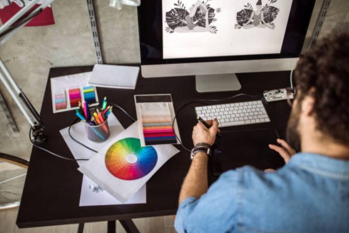
Whether its a company business card, a letterhead, a poster, an ad in the paper, a web site, or any host of business presentation materials, you need a superb graphic design to stand out in this highly competitive world. As the old saying goes, You never get a second chance to make a first impression.
Great first impressions are made by outstanding graphic design.
There are people who take years in university or college to study graphic design. The good thing is that if you’re not one of them there’s still hope!
Large corporations contract companies or highly capable individuals who can look after their corporate identity, but the rest of us need to either hire the local printing shop or do the design work ourselves.
Today, being able to create a good company image is not the stumbling block it was years ago. Most computer programs, like word processors, desktop publishers, etc., have ‘wizards’ that will help you create an identity for your business by using existing templates.
All you need to do is plug in your own information. These programs can create business cards, logos, brochures, newsletters, posters, and a host of other related presentation materials.
There are even software programs that will create a very professional company logo, whether your business is very conservative or very outlandish. Some of these are less than 20.
Web sites are also a major part of a company’s identity, more so if you are actually developing or own an online company. By searching the Internet, you can buy templates for your web site that will almost be a perfect fit for your business, whether you are selling online or offline.
Even the presentation of information, the actual words that tell about your product or service, or anything related, needs to be considered a graphic design element.
Consider some of the posters that promote milk. The advertising companies that promote the drinking of milk could write a multitude of words explaining the chemical make-up of milk and why you should drink it.
Instead, they add a large photo image of an active person drinking it outdoors, with a cow in the background, and place one word in the corner of the poster, Milk. Everyone gets the meaning immediately from the photo, which is then reinforced by the word, or a few words.
When doing your own graphic design, the best principle to follow is that less is more. Allow for lots of space. People find it hard to focus on things that are cluttered. Think of a desk. You don’t really notice the desk when it’s cluttered with papers and junk. Remove the clutter and everyone notices the desk. Keep things clean and simple.
If you do have to present a lot of words, try adding visual interest by adding pull-quotes, which are boxes set in the text that quotes some of the highlights of the actual text. The box adds interest.
People usually notice the biggest, boldest item first, and then go left to right if no clear indication is given. In a newspaper article, its usually the photo first, then the headline, then bolded captions, then the actual article.
There’s no shame in looking at a design that works for someone else, and emulating it, but not copying it.
By keeping in mind what your desk, or focus, is, and by using all the tools at your disposal, many of which are free, you will be able to produce graphic designs that are both eye-catching and profitable.

